SQL Server, Power BI, and other Business Intelligence and data technologies

Category: Data Visualization

The Button

thebutton0

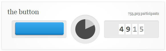
The Button.  Originally an April Fools Day joke / prank / experiment / curiosity, this simple and strange creation has become an internet phenomenon with countless resources being invested in it.  On 4/1/2015, Reddit announced a new feature, The Button.  The concept is very simple.  There is a button.  It controls a shared timer which is counts down from 60 seconds.  Pressing the button resets the timer back to 60 seconds (for everyone) and it restarts the countdown.  Anybody with a free Reddit account created before 4/1/2015 is allowed to press the button, but only once, ever.  That’s it.

And that is all there is to it.  A pretty simple concept.  Something that probably should’ve lasted a couple of minutes, maybe an hour or two, and then been gone, right?  Nope!  Instead it’s turned into a phenomenon which has been running perpetually for over two straight weeks with over 750,000 button presses thus far and no end in sight.

The is one additional twist to the button.  When you press the button your one and only time, your account is branded with the time, and a color, indicating what time you pressed it.  And others can see this.  This little twist has allowed for the possibility of an incredible amount of interesting data visualizations surrounding the enigma that is, The Button.

button_colors

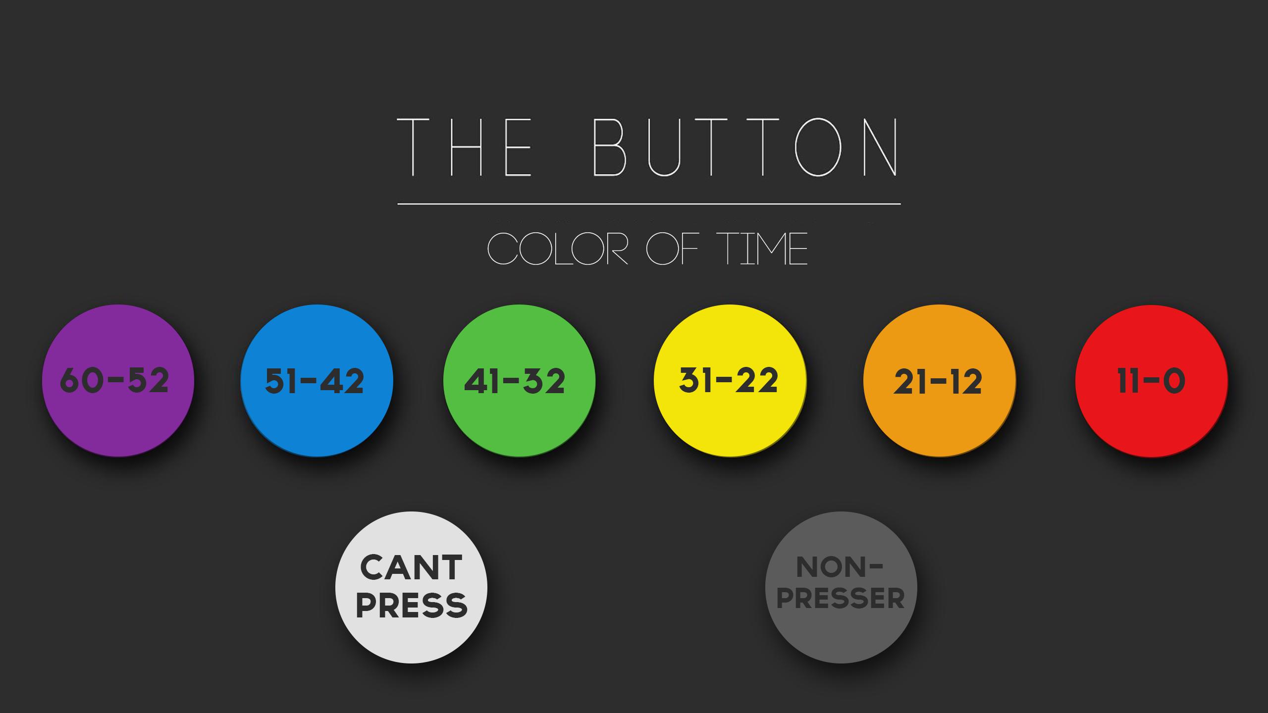
The circumstances above make The Button a really interesting data source.  It produces a constant stream of data (making real-time analytics valuable) and that data is time stamped and color coded based on how much time was remaining at the time of the press making for some very interesting visualizations.

Continue reading

Digging Out of the Snowstorm (Again)

Digging Out of the Snowstorm (Again)

Living in Georgia, snow is a pretty rare thing.  Even rarer is snow that actually sticks to the ground for more than one day.  Twice now within the last month, we’ve had major snow and/or ice events and even been the subject of some pretty funny news coverage.

We’ve had comparisons to the Walking Dead:

Source:  http://i.imgur.com/TMCSBfo.jpg

Due to people literally abandoning their cars on the roads and interstate due to them being impassable:

Source:  http://imgur.com/a/uREXR

Continue reading

Choosing the Right Chart Type

Choosing the Right Chart Type:  

On Monday night, I attended our monthly Atlanta Business Intelligence user group meeting.  The speaker this month was the amazing Jen Underwood  (B | T) presenting on the topic of Data Visualization Best Practices.

As anybody who is familiar with building the presentation layer for a set of data knows, choosing the right method to represent that data can be the most challenging and important part of the entire process.

Whenever I am designing a new report, I will list my requirements and brainstorm a list of what I want to convey with the report.  Once I’ve determined what message is to be conveyed, I’ll sketch out mock reports on paper until I’ve gone through a few iterations and gotten an idea of what I’m going to implement.

During the process of sketching out a mock report, the topic of deciding what types of charts to use comes up.  In Jen’s presentation on Data Visualization Best Practices, she pointed out a very handy resource — a chart of charts by Andrew Abela, to help determine which type of chart to use and when:

A great resource to print out and decorate your office wall!

Another great resource is the Periodic Table of Visualization Methods by Ralph Lengler and Martin J. Eppler which is an interactive resource which shows an example of each visualization method by hovering the mouse over the “element.”

There are many more great resources out there, including many by “the Moses of Data Visualization,” Stephen Few which I’ll cover in future posts.  Happy charting!

Jen Underwood presenting Data Visualization Best Practices at the Atlanta Business Intelligence April Users Group.

© 2026 Jeff Pries

Theme by Anders NorenUp ↑